Google Review Cards: Sizes, Copy, and the QR Code That Makes Them Work
What to print on a Google review card, what size to cut it, where to hand it, and the exact numbers on how many reviews 300 cards produce. Includes copy templates and print specs.
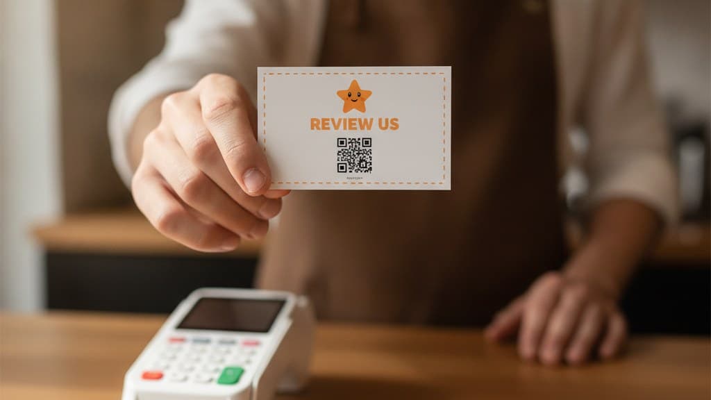
Google Review Cards: Sizes, Copy, and the QR Code That Makes Them Work
Turn happy customers into reviews
A Google review QR code that gets you more reviews in one scan. Included in every plan.
Get my review QR codeThere is a laminated card on your counter right now. It has your logo on it, a QR code, and some version of the sentence "we would love your feedback." It cost you eleven dollars at the print shop and it has been sitting in the same acrylic stand for four months.
Ask yourself honestly how many reviews you can trace to it. Most owners, when they actually check the scan data instead of guessing, find the answer is somewhere between two and none. The sign is not broken. The QR works. Customers just do not read the furniture.
Here is the part that stings: the same QR code, printed on a small card and placed into a customer's palm with one sentence attached, converts several times better. Same link. Same design. Same business. The only variable that changed is whether the ask was addressed to a specific human or to the room.
That gap is what this article is about. Below is the card size that actually fits the workflows you already have, the copy that survives a two-second read, the five moments where the card should change hands, and the math on what 300 handed cards produce in a month.
The Handed-Card Effect: why a card beats a sign
A sign is ambient. It sits in the environment, it is addressed to everybody, and the human brain is extraordinarily good at filtering out anything addressed to everybody. Your regulars stopped seeing that acrylic stand during their third visit. Your first-timers are looking at the menu, the price display, or the card terminal, because those are the objects the transaction requires them to look at. The review sign is competing with all of it and losing, permanently, every day.
A card is addressed. When a person takes a physical object from another person's hand, three things happen inside two seconds. They look at it, because a thing arriving in your hand demands a glance in a way a thing on a wall does not. They register that somebody chose to give it to them specifically. And they feel a small, entirely ordinary social pull to do something with it rather than nothing, which is the same pull that makes people take a flyer they have no intention of reading.
That is the Handed-Card Effect, and it is the entire mechanic. You are not upgrading your design. You are moving the ask out of the furniture and into a transaction between two people.
The practical consequence is that the design budget matters far less than the handoff. A plain white card with a QR and four words, handed with a sentence, will beat a beautifully art-directed card left in a stand every single week. If you have limited effort to spend, spend it on the sentence your staff says, not on the card stock.
What a box of cards is actually worth
Review cards are the cheapest customer-acquisition object a local business can buy, and most owners never do the arithmetic because the numbers feel too small to bother with.
Start with the cost side. A run of 250 standard business cards at a local print shop or an online printer runs roughly $12 to $20 depending on stock and finish. Call it $0.06 a card. Cut and print them yourself on perforated card stock and it drops closer to $0.03. That is the entire cost structure. There is no per-scan fee, no ad spend, and no ongoing commitment.
Now the value side. The reason a review is worth anything is that review count and recency both feed how your business ranks in the Google map pack for the searches that matter locally, and they feed whether the person looking at that map pack picks you or the shop two blocks over. A business sitting at 22 reviews and a business sitting at 68 reviews get read very differently by the same customer, even when both average 4.7 stars.
The asymmetry that makes review cards obviously worth doing
Handing out 250 cards costs you about $15. At a 30 percent scan rate and a 40 percent scan-to-review completion rate, that box produces roughly 30 new reviews, which works out to about $0.50 per review. If that entire month of cards produces even one additional customer who found you through improved local visibility, at a $60 average ticket and two visits a year, you are at 8 to 1 on card cost against first-year revenue. From one customer. Every review after that one is free upside.
The point of running the numbers is not to prove the cards are profitable. At $15 a month they are almost impossible to make unprofitable. The point is to see that the binding constraint is not cost. It is whether the cards leave the box. A stack of 250 cards sitting in a drawer behind the register has exactly the same return as no cards at all, which is why the handoff sections below matter more than the design sections.
Three review card formats worth printing
There are three formats that survive contact with a real counter. Pick one to start. Add a second only after you have two weeks of scan data on the first.
Format 1: The wallet card
Shape: Standard 3.5 by 2 inch card. Review QR centered, business name above it, one instruction line below.
This is the default and it is the right default for any business with a payment moment where staff and customer face each other: cafes, barbers, nail techs, boutiques, repair counters, takeaway windows. It is handed at the card terminal or with the change, and it goes into a wallet or a pocket where it survives the trip home.
Best handed to: Every customer who had a normal or good visit, at the payment moment. Why it works: The payment moment is the only point in the visit where the customer's hands are already open and their attention is already on you.
Format 2: The bag-drop card
Shape: Same 3.5 by 2 inch card, sometimes a slightly heavier stock so it does not bend in transit.
Some businesses have no face-to-face closing moment. Takeaway that goes out through a hatch, flower deliveries, dry cleaning that gets collected off a rail, e-bike repairs picked up from a rack. For these, the card gets dropped into the bag on top of the item, or clipped to the garment bag, or tucked into the box lid. The customer finds it when they unpack, which is a genuinely good moment: they are looking at the thing they bought, alone, with their phone already in the other hand.
Best handed to: Any order that leaves your premises in a container. Why it works: The unpacking moment has zero competition for attention, which is the one thing the counter handoff cannot offer.
Format 3: The double-sided comeback card
Shape: Review QR on the front, single-use coupon QR on the back.
This is the format that changes the economics, because it turns one printed object into two jobs. The front asks for something. The back gives something. The customer scans one side today and keeps the card in their wallet for the other side, which means your card does not get thrown out with the receipt.
Keep the two sides strictly independent. The coupon on the back is not a payment for the review and must never be presented as one, because conditioning a reward on leaving a review is against Google policy and is a good way to have your reviews filtered out entirely. It is an unconditional thank-you that happens to share a piece of cardboard with a review ask.
Best handed to: First-time customers and lapsed regulars, where you want both the review and the return visit. Why it works: A card with something on it for the customer gets kept. A card that only asks gets binned at the first traffic light.
Do This
- ✓Start with one format and run it alone for two weeks before adding a second
- ✓Use a trackable QR so you can see which format and placement produces scans
- ✓Print in small runs (250) so you can rewrite the copy after real data
- ✓Keep the review side and the coupon side logically independent
- ✓Hand the card, do not leave a stack of them on the counter
Avoid This
- ✕Don't ask for a specific star rating anywhere on the card (against Google policy)
- ✕Don't offer anything in exchange for a review (reviews get filtered)
- ✕Don't print more than one QR on the same side of a card
- ✕Don't add a URL under the QR that competes with it for attention
- ✕Don't use a glossy laminate on the QR side (glare kills scans under counter lights)
What to actually write on the card
The single most common failure in a review card is writing too much. A card is read in about two seconds, one-handed, often while the person is standing up or reaching for their keys. Every sentence you add competes with the QR for those two seconds and none of them win.
A complete card needs three things and no more: who is asking, what to do, and the code.
Template A, the plain one. Business name at the top. QR in the middle. "Scan to review us on Google" underneath. That is the whole card. It is boring and it outperforms almost everything more elaborate.
Template B, the personal one. "Thanks for coming in today." QR. "Tell Google how we did." This version reads as if a person wrote it, which suits salons, barbers, groomers, and any business where one named staff member did the work.
Template C, the double-sided one. Front: business name, QR, "Scan to review us on Google." Back: "$5 off your next visit" with the coupon QR and an expiry date printed as an actual date, not as a duration. "Valid until March 14" beats "valid 30 days" because a duration requires the customer to do arithmetic and remember when they got it.
Never print a star rating request. "Leave us a 5-star review," "rate us 5 stars," or a graphic of five filled stars all constitute soliciting a specific rating, which violates Google's review policies. The risk is not theoretical: Google filters reviews it believes were solicited with a rating attached, and the reviews you lose are the exact ones you worked for. Ask for a review. Let the customer pick the number.
Three more copy rules that come from watching real cards fail. Do not print the review URL as text underneath the QR, because it makes the card look like a spam flyer and nobody types a URL off a card in 2026. Do not write "we value your feedback," which is corporate wallpaper that adds a line of reading and zero motivation. And put your business name on the card even though the QR leads somewhere that identifies you, because a card found in a coat pocket three weeks later with no name on it goes straight in the bin.
Turn one visit into many
Hand out single-use QR coupons that pull customers back through your door. Part of your Customer Comeback System. 14-day free trial, cancel anytime.
Create a couponSizes, stock, and the specs that decide the scan
Most of the design decisions on a review card do not matter. Four of them do, and all four are about whether the phone camera locks on quickly.
| Spec | What to use | Why |
|---|---|---|
| Card size | 3.5 × 2 in (US) or 85 × 55 mm (EU) | Fits wallets, apron pockets, receipt folds, and every card holder |
| Printed QR size | 1 in (25 mm), never below 0.8 in (2 cm) | Below 0.8 in the camera hunts for focus at arm length and people give up |
| Quiet zone | 4 modules of blank space around the QR | Text crowding the QR edge is the most common scan failure in the wild |
| Finish on QR side | Matte or uncoated | Gloss reflects overhead counter lights straight into the lens |
Contrast is the fifth item and it deserves its own sentence. Dark code on a light background, always. Light code on a dark background works on a phone screen and fails on cardboard under a warm bulb roughly a third of the time, which is a third of your program gone for an aesthetic preference. If your brand is dark, put the dark on the reverse side and keep the QR side light.
Stock weight is the one place where spending slightly more pays back. A 300 to 350 gsm card feels like something worth keeping. A 200 gsm card feels like a receipt and gets treated like one. The difference across 250 cards is a couple of dollars.
Where the card changes hands
A card only works at the moment it is handed over, so the placement question is really a timing question. Five moments that consistently outperform leaving cards in a stand:
Into the palm at the card terminal
The customer is standing still, facing you, with a hand already out and their phone already unlocked or in their hand. This is the highest-attention two seconds in the entire visit. Hand the card in the same motion as the receipt, not before it and not after they have turned away.
Tucked into the receipt fold
For sit-down businesses using a check presenter or bill folder, slip the card inside the fold with the QR facing up. The customer opens the folder to pay, sees the card, and it is in front of them for the whole length of the payment. This is one of the few passive placements that works, because the folder guarantees the card is opened.
On top of the item in the bag
For takeaway, retail, or anything that leaves in a container: the card goes on top, not in the bottom. Bottom-of-bag cards are found while throwing the bag out, which is precisely the wrong moment. Top-of-bag cards are found while unpacking, when the customer is looking at what they bought.
Clipped to the invoice or work order
For repair shops, groomers, cleaners, and any business that hands over paperwork with the finished job. The invoice gets read carefully because money is involved, and anything paperclipped to it gets read with it. Free attention riding on a document the customer already has to process.
Handed by the person who did the work
The stylist, the tech, the groomer, the barista who remembered the order. A card handed by the named person who performed the service converts noticeably better than the same card handed by whoever is on the register, because the review the customer is being asked to write is about that specific person.
The pattern across all five is that the card arrives attached to something the customer already has to deal with: a payment, a bill, a bag, an invoice, a person. Cards that arrive attached to nothing get treated like nothing.
The math on 300 cards
Take a small counter business handing out 10 cards a day, six days a week. That is roughly 250 to 300 cards in a month, one box.
Not every card gets scanned. Handed cards with a sentence attached scan at roughly 30 percent, which is the number to plan against. Of the people who scan, not everybody finishes: they land on the Google review page, some write immediately, some intend to and never return. Completion runs around 40 percent on a well-built flow that drops the customer straight onto the review composer rather than making them find your profile first.
Thirty-six reviews in a month is transformative for a business sitting at 20 and merely good for a business sitting at 400. That is worth saying plainly, because the cards are not equally valuable to everyone. If you are under 50 reviews, this single box of cardboard is likely the highest-leverage marketing spend available to you this quarter. If you are over 300 reviews, the cards are a maintenance tool for recency rather than a growth lever, and the coupon side of the card is where the actual return moves to.
The honest caveat: the 30 percent scan rate assumes the card is handed with a sentence. Cards left in a stack on the counter scan in the low single digits, and if you plug that number into the math above you get 3 or 4 reviews instead of 36. The staff handoff is not a detail of the program. It is roughly nine tenths of the program.
The counter script that makes the card land
A card handed over in silence is a flyer. A card handed over with one sentence is a request from a person. The sentence is short, and it does almost all of the work the card gets credit for.
Bad version (sounds like marketing): "Here's a card, we'd really appreciate it if you could leave us a review, it helps us out a lot."
Good version (sounds like a person): "If you've got ten seconds, this helps us out."
The good version is eight words. It gives an honest, tiny time estimate, which removes the main objection before it forms. It says "helps us out" instead of naming the platform, which keeps it human. And it stops, which is the hardest part for most staff, because the instinct after asking for something is to keep talking, and the extra sentence is where the customer's polite yes turns into a vague maybe.
Two adjustments worth making. If a specific staff member did the work, they should hand the card themselves and say "if you've got ten seconds, it means a lot to me," because the review is going to be about them. And nobody should hand a card to a customer who had a bad visit. The card is for people who left happy, and staff need explicit permission to skip anyone who did not.
Consistency across staff is the biggest single predictor of whether a card program shows up in your review count. Two people running the script and one person skipping it will roughly halve your numbers, and the scan data will show you exactly which shifts are which.
Making your cards in 6 minutes
Create your review QR (14-day free trial)
Sign in with any email at reviewqr.app and connect your Google Business Profile. The QR points straight at your review composer, not at your profile page, which removes the two taps where most scans die. Every plan starts with a 14-day free trial, card on file, cancel anytime.
Pick your card format
Wallet card if you have a face-to-face payment moment. Bag-drop card if your orders leave in a container. Double-sided comeback card if you want the return visit as well as the review. Start with exactly one.
Lay out the card with three elements
Business name, QR at 1 inch, one instruction line. Leave a clear quiet zone around the QR. No stars, no rating request, no URL text, no paragraph of appreciation. If the card looks slightly too empty, it is correct.
Print 250 on 300 gsm, matte on the QR side
Any local print shop or online printer does this for $12 to $20. Matte matters more than the stock does, because gloss under counter lighting reflects straight into the camera. Do not order 2,000 on the first run.
Brief the staff on the eight-word script
"If you've got ten seconds, this helps us out." Practice it once at the start of a shift. Tell staff explicitly that they should skip anyone who had a bad visit, so nobody feels they have to hand one to everybody.
Check the scan data after 7 days
Scan count against cards handed gives you your real scan rate. If it is under 15 percent, the cards are being left on the counter rather than handed over, and the fix is the script, not the card. If it is over 25 percent, print the next run and add the coupon back.
If you want the back of the card working as hard as the front, the coupon side is where the return visit comes from. The Essentials plan at $10 per month covers 100 single-use coupon codes monthly, which is the right volume for a counter business handing double-sided cards to first-timers and lapsed regulars rather than to everybody.
Common Google review card mistakes
Mistake 1: Leaving the cards in a stack instead of handing them. This is the mistake, and every other one on this list is a rounding error next to it. A stack on the counter is a sign with extra steps, and it converts like a sign: low single digits. The entire premise of the card is that it is placed in a hand by a person. If your staff will not hand them, you do not have a card program, you have a more expensive sign.
Mistake 2: Asking for five stars. "Leave us a 5-star review" violates Google's policy on soliciting a specific rating, and the reviews it produces are exactly the ones most likely to be filtered. Ask for a review, not for a number.
Mistake 3: Printing a QR smaller than 0.8 inches. Designers shrink the QR to balance the layout. Phone cameras at arm length then hunt for focus for two seconds, and two seconds of hunting is the entire attention budget you had. Make the QR the biggest thing on the card and let the layout be slightly unbalanced.
Mistake 4: Gloss laminate on the QR side. Counter lighting is almost always overhead, gloss reflects it straight back into the lens, and the scan fails in a way the customer reads as "this doesn't work" rather than "the light is bad." Matte or uncoated on the QR side, always.
Mistake 5: Using a static QR you cannot track. A static code works forever and tells you nothing. Without scan data you cannot tell whether your cards are being handed out, whether the morning shift is doing it, or whether the bag-drop beats the counter handoff. You end up guessing about the only decision that matters.
Mistake 6: Ordering 2,000 cards on the first run. The copy on your first card will be wrong in some small way you can only discover by watching people read it. Print 250, fix the copy, then print the volume. The box of 1,750 obsolete cards in the stockroom is the most common reason a review card program quietly dies.
Related reading
If you want the broader QR-based review playbook rather than the card specifically, the review us QR code guide covers signage, placement maps, and print specs for the display side, and the free Google review QR code guide walks the setup end to end. For the ask itself, how to ask customers for Google reviews without being pushy is the script-level companion to this article. On the coupon side of the double-sided card, the QR coupons for small business overview explains the single-use mechanic, coupon ideas for small business groups 23 plays by goal, and best QR coupon app for small business compares the tools side by side.
Frequently asked questions
What size should a Google review card be?
Standard business card, 3.5 by 2 inches in the US or 85 by 55 mm in Europe. That size is not a design preference, it is a logistics decision. It fits every card holder, every wallet, every receipt fold, and every apron pocket your staff already own, and it prints on stock every local print shop keeps in the building. The one dimension that matters more than the card is the QR itself: print it at least 0.8 inches (2 cm) across, and 1 inch (25 mm) if you have the room. Below 0.8 inches a phone camera at arm length starts hunting for focus, and the two seconds of hunting is where you lose the scan.
What should I write on a Google review card?
One line that says who is asking, one line that says what to do, and nothing else. "Scan to review us on Google" plus your business name plus the QR is a complete card. The most common mistake is writing a paragraph. A review card is read in about two seconds, in one hand, usually while the person is standing up or reaching for their keys. Every extra sentence competes with the QR for those two seconds. Leave off the "we value your feedback" language, leave off the star graphics, and never write "leave us a 5-star review" because Google prohibits soliciting a specific rating.
Do Google review cards actually work better than a sign on the counter?
Yes, by a wide margin, and the reason is not the card. It is the hand. A sign on the counter is addressed to nobody, so it is read as decoration and filtered out within a week by regulars. A card placed into a specific person palm is addressed to them, arrives with a sentence from a human, and creates a small social obligation that a laminated sign never will. In practice a handed card gets scanned several times more often than the same QR sitting on the same counter as ambient signage. Print both if you like, but the card is the one that moves the number.
Can I put a coupon on the back of a Google review card?
Yes, and it is the single best use of the reverse side. The front carries the review QR and asks for something. The back carries a single-use coupon QR and gives something. Do not make the coupon conditional on the review being left, because tying a reward to a review violates Google policy and can get your reviews filtered. Keep them independent: the review ask stands on its own, and the coupon on the back is an unconditional thank-you that also happens to be the thing that brings the customer back in.
How many review cards should I print to start?
Print 250 and hand them all inside a month. That is roughly 8 to 10 a day for a small counter business, which is enough volume to get a real read on your scan rate instead of a rumor. At typical print-shop pricing 250 cards land between $12 and $20, so the whole experiment costs less than a slow Tuesday lunch. Do not print 2,000 on the first run. You will want to change the copy after the first two weeks, and a box of 1,750 obsolete cards is the most common reason businesses quietly stop running the program.
Does the QR code on the card need to be dynamic?
It needs to be trackable, which in practice means dynamic. A static QR encodes your Google review URL directly, works forever, and tells you absolutely nothing. A dynamic QR routes through a short link first, which means you can see scan counts, scan times, and which placement is producing them, and you can repoint the code if your Google profile URL ever changes without reprinting a single card. The cost difference is nothing. The information difference is the whole reason you can tell whether the counter handoff or the bag drop is doing the work.
Ready to Implement This Strategy?
Create your custom QR code in 2 minutes and start collecting Google reviews today.
Create Your QR Code NowMore Google Review Guides
How to Create a QR Code for Google Reviews (Free, No Expiry)
Step-by-step guide to creating a free QR code for Google reviews. Learn why QR codes outperform traditional methods and how to track results with analytics.
guidesSmall Business Loyalty Program: No App, No Points, Just a Coupon
Every loyalty program charges the customer an enrollment tax before it can reward anything, and only your regulars ever pay it. The math on what that costs, and the three-play coupon system that replaces it, with placement geometry and a counter script.
guidesGoogle Review Tap Card vs QR Code: Cost, Setup, and What Customers Actually Do
An NFC tap card converts better than a QR code at the counter and worse everywhere else. The honest numbers on cost per review, phone compatibility, and which one earns the return visit.